
Designing the Ideal Retail
Homepage
Exploring how visual hierarchy and emotional design influence first impressions in retail shopping experiences.
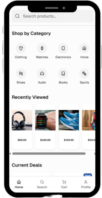
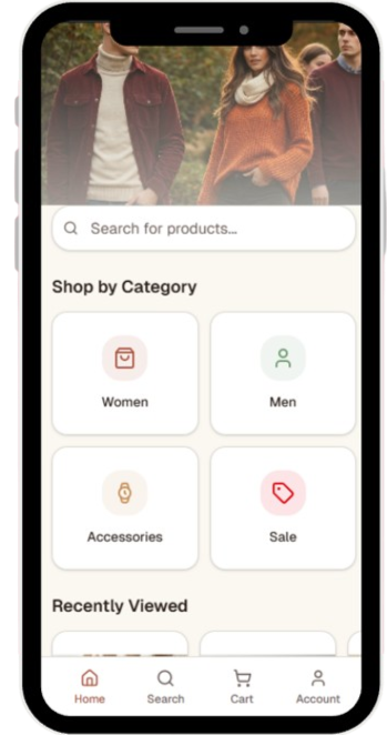
Project Summary
Retail app homepages are often the first interaction users have with a brand, yet many struggle to balance visual appeal with usability. This project explored how hierarchy, imagery, and familiarity shape users’ first impressions and navigation behaviors through card sorting, prototype comparisons, five-second testing, first-click testing, and emotional reflection exercises. The findings showed that users valued clear navigation and familiar layouts, while subtle visual personality helped build trust and comfort.

The Challenge
Retail homepages need to communicate information quickly while also establishing a positive emotional connection. Designers often face a tradeoff between creating visually engaging interfaces and maintaining clarity. This project explored where users believe that balance should exist and how design decisions influence both usability and first impressions.

My Role
Planned and conducted qualitative UX research
Designed and tested two homepage prototypes
Facilitated card sorting and first-impression studies
Synthesized findings into actionable design recommendations
Presented research findings and design implications
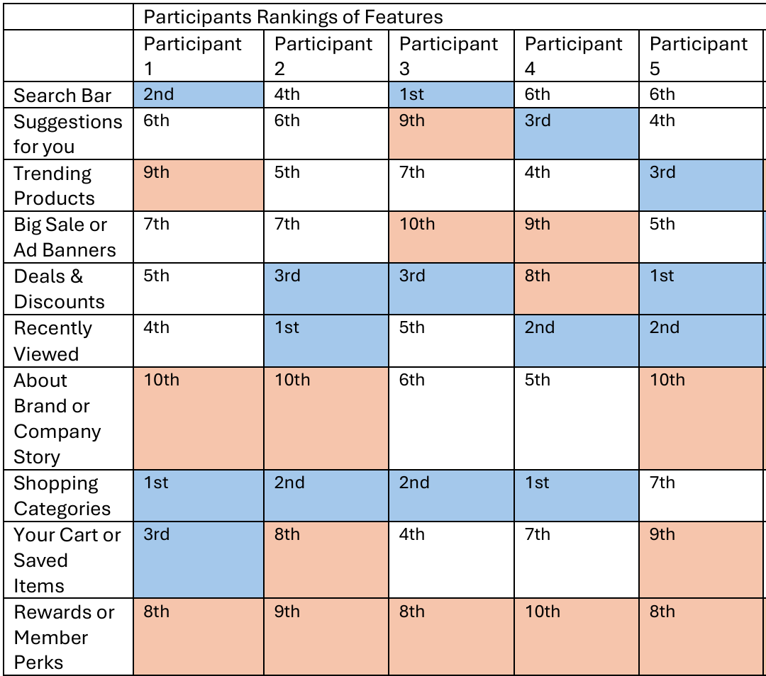
Card sorting graph for participant rankings of each homepage section
Research Methods
Card Sorting
Prototyping
First Impression Testing
First Click Testing
Surveys
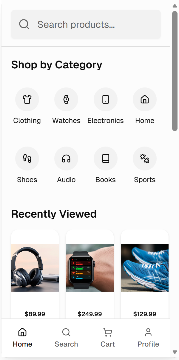
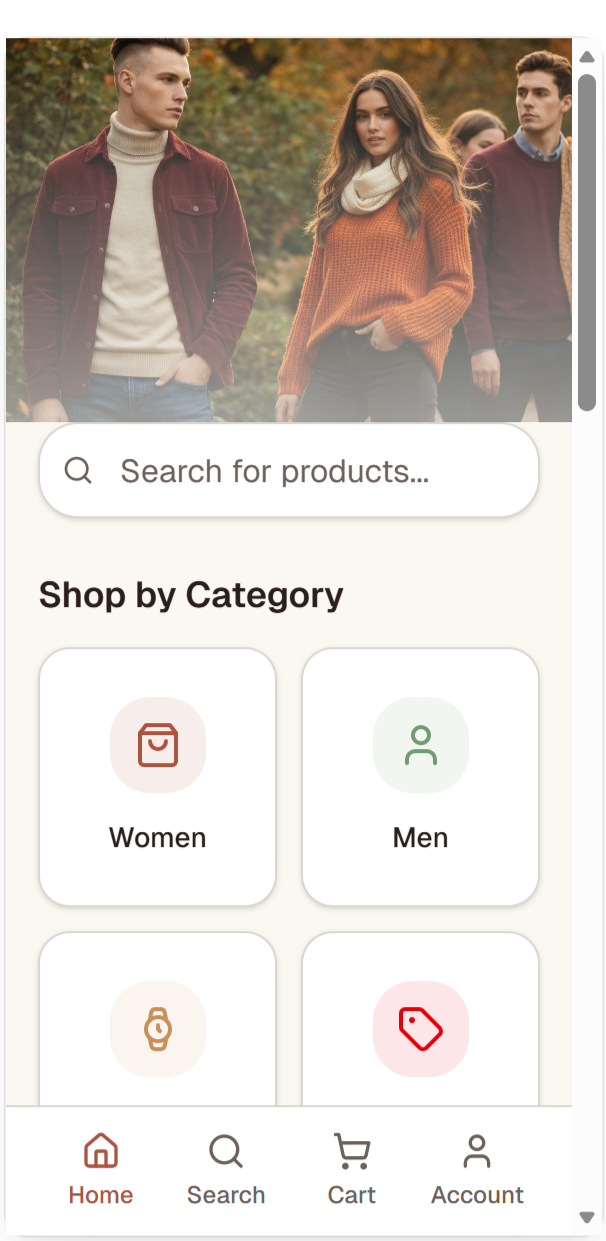
Prototypes created using rankings from card sorting, then used for further testing.
Key Insights
-
Design Principle: Visual Hierarchy & Progressive Disclosure
Participants consistently looked for search and category navigation first, relying on these elements to orient themselves within the interface. Strong visual hierarchy reduced cognitive effort by making key actions immediately discoverable, reinforcing the importance of prioritizing essential content before secondary information.
Takeaway: Prioritize the most important actions through clear hierarchy, allowing users to quickly understand where to begin.
-
Design Principle: Mental Models & Jakob's Law
Users gravitated toward layouts that resembled retail experiences they already knew, frequently referencing familiar platforms like Amazon and Target. Familiar interface patterns reduced uncertainty and helped users navigate with confidence because they aligned with existing mental models.
Takeaway: Leverage established interaction patterns before introducing novelty to reduce cognitive load and increase usability.
-
Design Principle: Emotional Design (Don Norman) & Aesthetic–Usability Effect
Although participants initially claimed imagery was unimportant, they consistently preferred prototypes that incorporated subtle warmth and visual personality. Emotional cues influenced perceived usability, suggesting that users often feel more comfortable interacting with interfaces that are aesthetically inviting.
Takeaway: Thoughtful visual design can strengthen trust and engagement without compromising clarity.
-
Design Principle: Simplicity Without Oversimplification
Neither an overly minimal interface nor one filled with promotional content produced the strongest response. Users preferred a balanced experience that paired efficient navigation with enough visual personality to feel engaging, demonstrating that effective design requires thoughtful tradeoffs rather than extremes.
Takeaway: Balance usability and brand expression to create interfaces that are both functional and memorable.
Design Recommendations
-
1. Prioritize search and categories as primary navigation anchors.
-
2. Introduce subtle visual personality without compromising clarity.
-
3. Balance structure and branding to create interfaces that feel both intuitive and inviting.
Reflection
This project reinforced how quickly users form opinions about digital products—often within just a few seconds. One of my biggest takeaways was that users don't always articulate what influences their decisions. While participants emphasized functionality, their behavior consistently showed that subtle emotional cues and familiar patterns shaped their comfort and trust. This experience strengthened my appreciation for combining qualitative research with behavioral observation to inform thoughtful design decisions.